Federal government agency · 2026
A design system that started with accessibility
A small UX team, dozens of systems and no shared foundation. I led the creation of a design system with one rule from day one, nothing ships without accessibility, and today I curate it.
- Role
- UX lead and curator
- Team
- The agency's UX team, engaged developers and the PO, as a committee
- Platform
- Design system, Figma and Material UI
- Year
- 2026
In short
- Problem
- Dozens of systems, each with its own code standards and colors, and accessibility being fixed one system at a time.
- What I did
- I led the UX side of a design system built on Brazil's gov.br standard and Material UI, with accessibility as the rule, and took on its curation.
- Outcome
- Around 200 screens prototyped in 10 days in the first trial, consistent breakpoints and an accessibility process the whole team follows.
Context
We are a small UX team at a federal government agency, and each designer handles several projects at a time. Some systems are legacy, some are in development and some are still being planned, and many of them talk to each other. All together, there are dozens.
The problem
However much we aligned the visuals, each system pulled in its own direction. Some were legacy, others used different languages and development styles, and every PO or client had their own requests. We ended up with systems that looked alike on the outside and worked differently on the inside.
Accessibility made it obvious. I was leading accessibility on one of the agency’s main systems, and it made no sense to make that one accessible while the others stayed as they were. Colors had become a problem too: every system had its own palette, and we were running out of combinations with enough contrast.
The decision
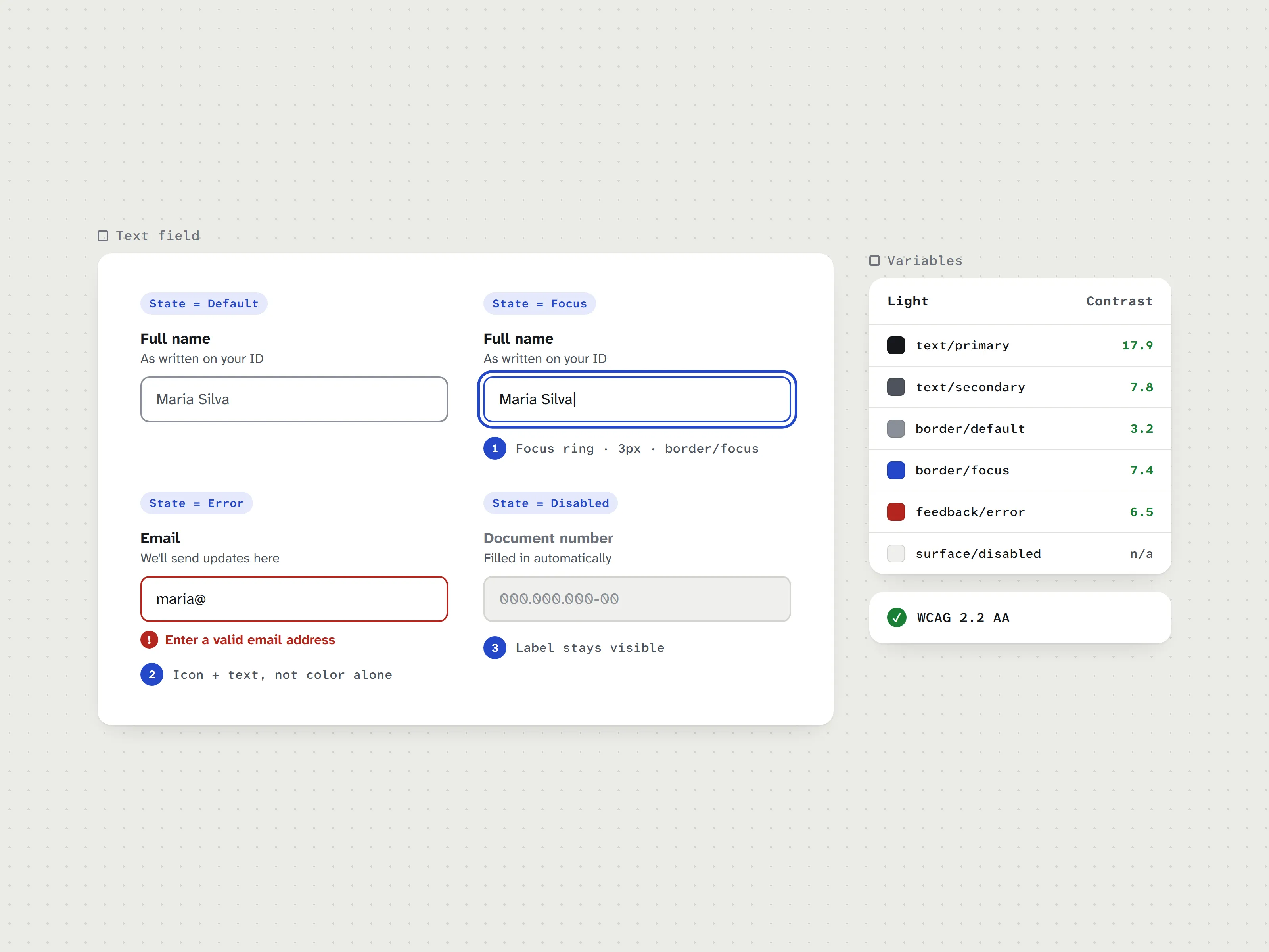
Instead of fixing one system at a time, we joined forces. With a few engaged developers, we started a design system alongside the projects. I led the UX side and, since it all started with accessibility, that became the rule: no component gets in without passing the criteria.
Why gov.br and Material UI
Brazil’s Digital Government Standard was already on our radar. Citizens recognize gov.br, and it was built for public services. Material UI was already the developers’ standard. Combining the two gave the design system a language that feels familiar to the people using it and a short path for the people building it.
How we built it
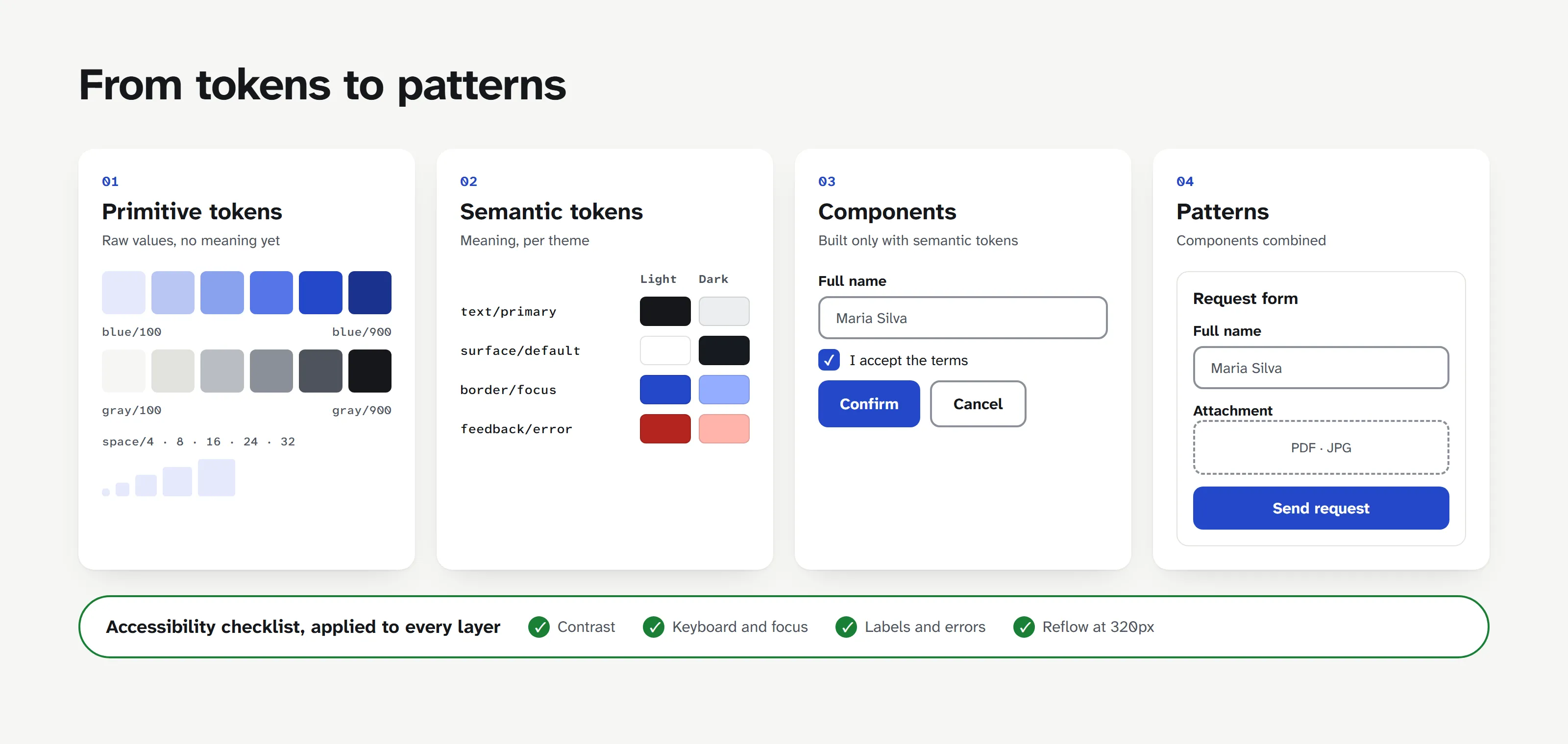
Tokens first. A palette of primitives and, on top of it, semantic tokens for light and dark themes, with contrast rules built in. We replaced each system’s mix of colors with a single institutional tone, which solved most of the contrast problem.
Foundations before components. Focus and keyboard navigation, skip links, typography, spacing, borders, shadows and elevation came before any button.
Components like Lego. We followed atomic design: small pieces combine into bigger components. The rich text editor, for example, is assembled from the design system’s own pieces. In an agency that runs on forms, that matters a lot.
AI for the mechanical work. I used an AI agent in Figma for the repetitive parts, like creating variants and applying tokens to each one. Design and accessibility decisions stayed with me. The agent just took over what I would otherwise do by hand.
Accessibility as a process
I created a WCAG checklist adapted to the agency’s reality, which applies both to components and to the systems that use them. Day to day, axe DevTools stays open in the browser and Stark checks contrast in Figma. Along with the design system came a usability and accessibility process the whole team follows.
Governance
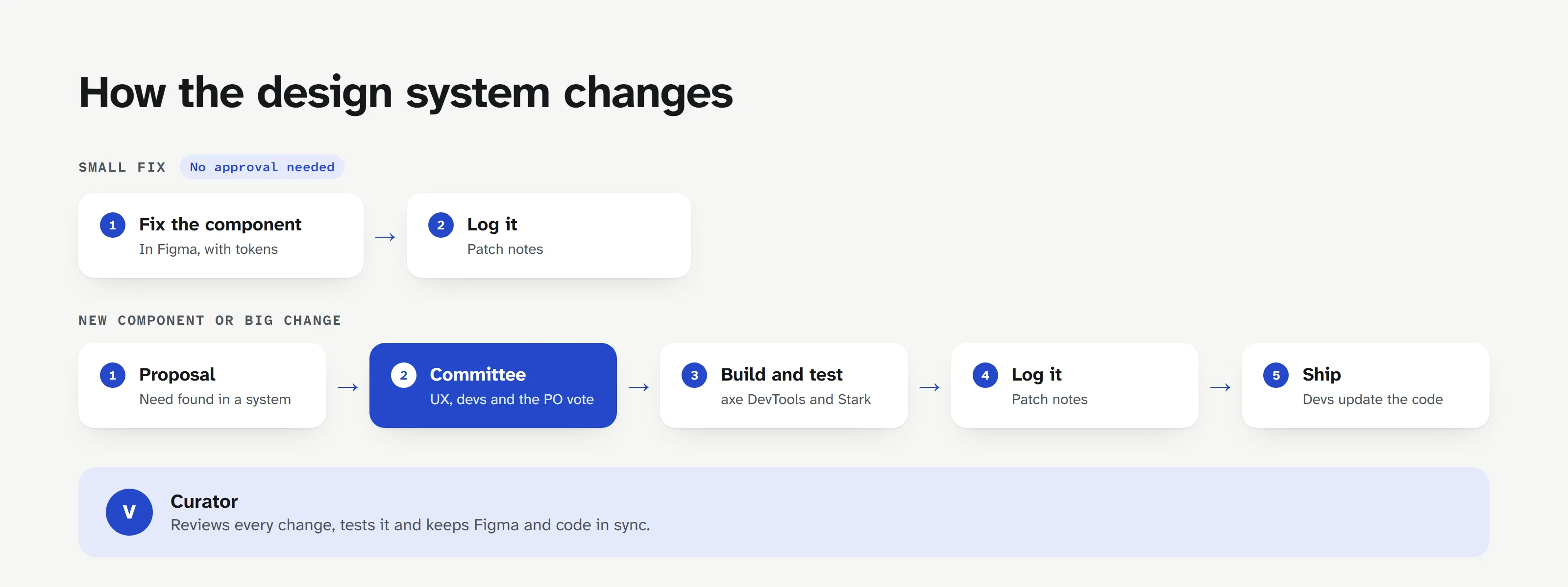
A design system is a living thing, and it needs rules to change without turning into a mess. Small fixes go straight in. New components and big changes go through a committee with the PO, which follows the work and votes. Complex components can be customized when a system really needs it, with caveats and approval. And patch notes in Figma record every change.
Curation
Since my projects would be the first to use the design system, I took on its curation. I adjust components, test them and work with the developers so the code keeps up with Figma.
Results
The design system has launched and is being rolled out to the first systems, starting with mine. Like any design system, it keeps evolving.
In the first trial with the design system, I prototyped a system of around 200 screens in 10 days. Before, with stylesheets and loose components, that would have taken much longer.
For the first time we had consistent breakpoints on phone, tablet and desktop. The team picked it up quickly, precisely because everything was standardized, and the client was happy to see a more modern, consistent look across systems.
What I’d do differently
We never measured how long things took before the design system, so today I can only compare from experience. Next time, I’d record a few numbers from the start: time to prototype a screen, back-and-forth during handoff and accessibility issues found per system. That would turn the gain from an impression into a before and after.