Personal project · 2026
This portfolio
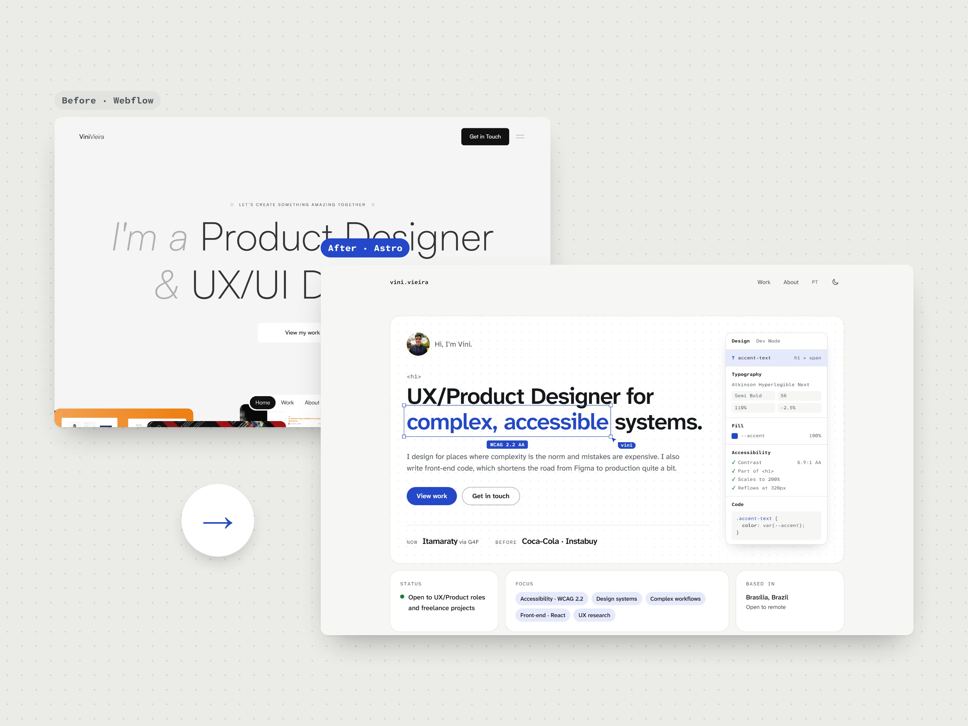
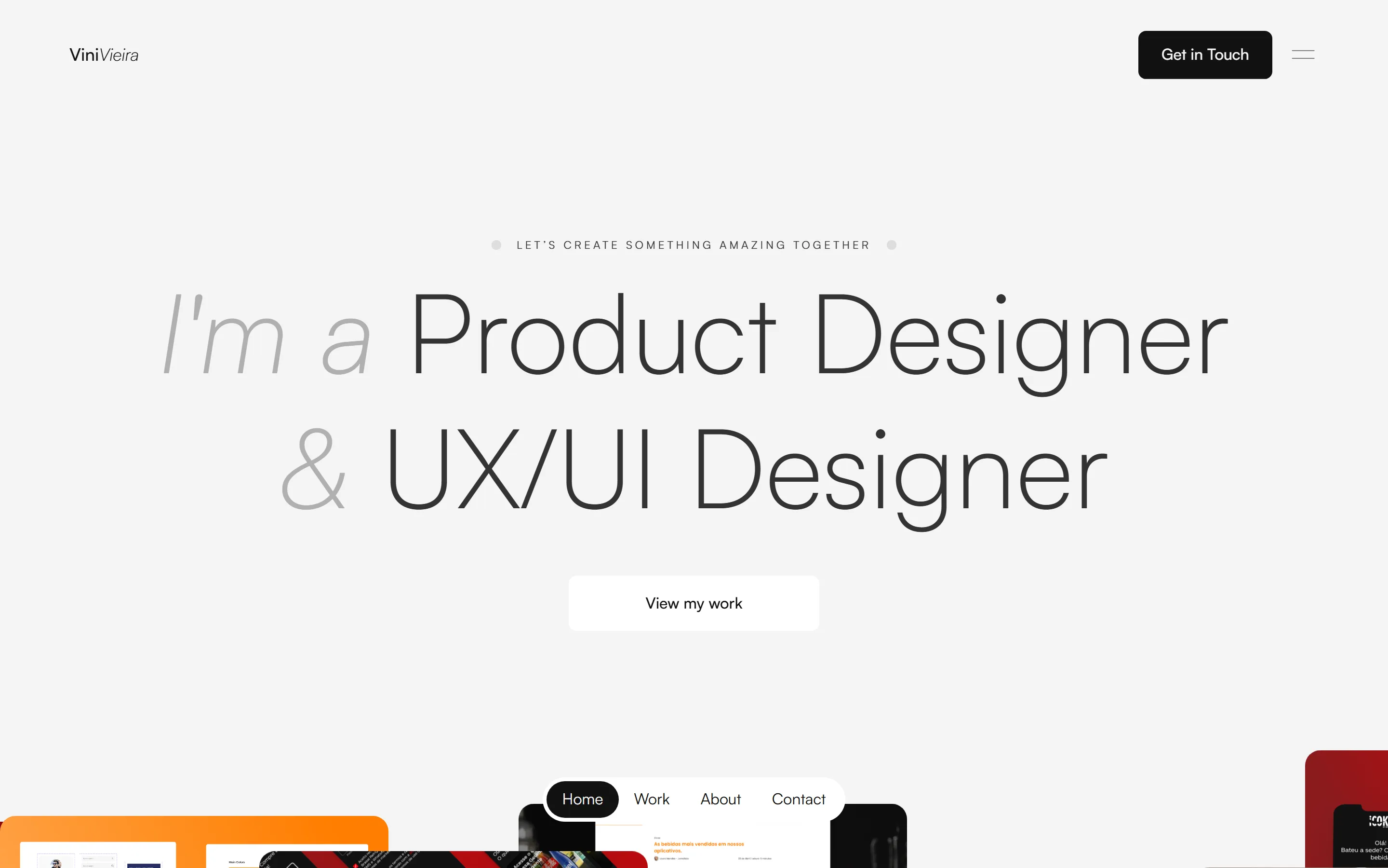
My old portfolio sold Webflow websites and stopped in 2023. I rebuilt everything, from positioning to code, and the site itself became proof of what I say I do.
- Role
- Audit, writing, design and front-end
- Team
- Solo project
- Platform
- Website, Astro and Tailwind CSS
- Year
- 2026
In short
- Problem
- The old site positioned me as a Webflow expert, had visible bugs and basic accessibility issues, and cost R$ 250 to R$ 280 a month, billed in dollars.
- What I did
- I audited the site the way I would a client's, rewrote the positioning and copy, designed an identity between design and code and built it all in Astro.
- Outcome
- Zero axe violations on every page, in both themes and both languages, with free hosting and changes live in under a minute.
Context
My old portfolio was on Webflow. It did the job of existing, but it didn’t say who I am today, and it cost R$ 250 to R$ 280 a month, billed in dollars, for a platform that no longer made sense for me.
The problem
When I audited my own site, the way I would a client’s, the list was long. The copy talked about being a “Webflow Expert” and “transforming your website”, like someone selling websites, not someone designing products. My most relevant work, at Itamaraty, wasn’t there. The case studies stopped in 2023 and had numbers with no source. There were visible bugs, like a stray “No items found.” in the middle of the case studies and a “next project” link that pointed back to itself.
And accessibility had basic issues: four main headings on the same page, no main content region and no link to skip the navigation. For someone who works in accessibility, that one hurt.
My role
I owned the project end to end: audit, positioning, copy, design, front-end, deployment and security. I used AI as a tool to speed up parts of the implementation, the same way I use it in Figma. Every product, design and accessibility decision was mine.
Key decisions
Words first, screens later
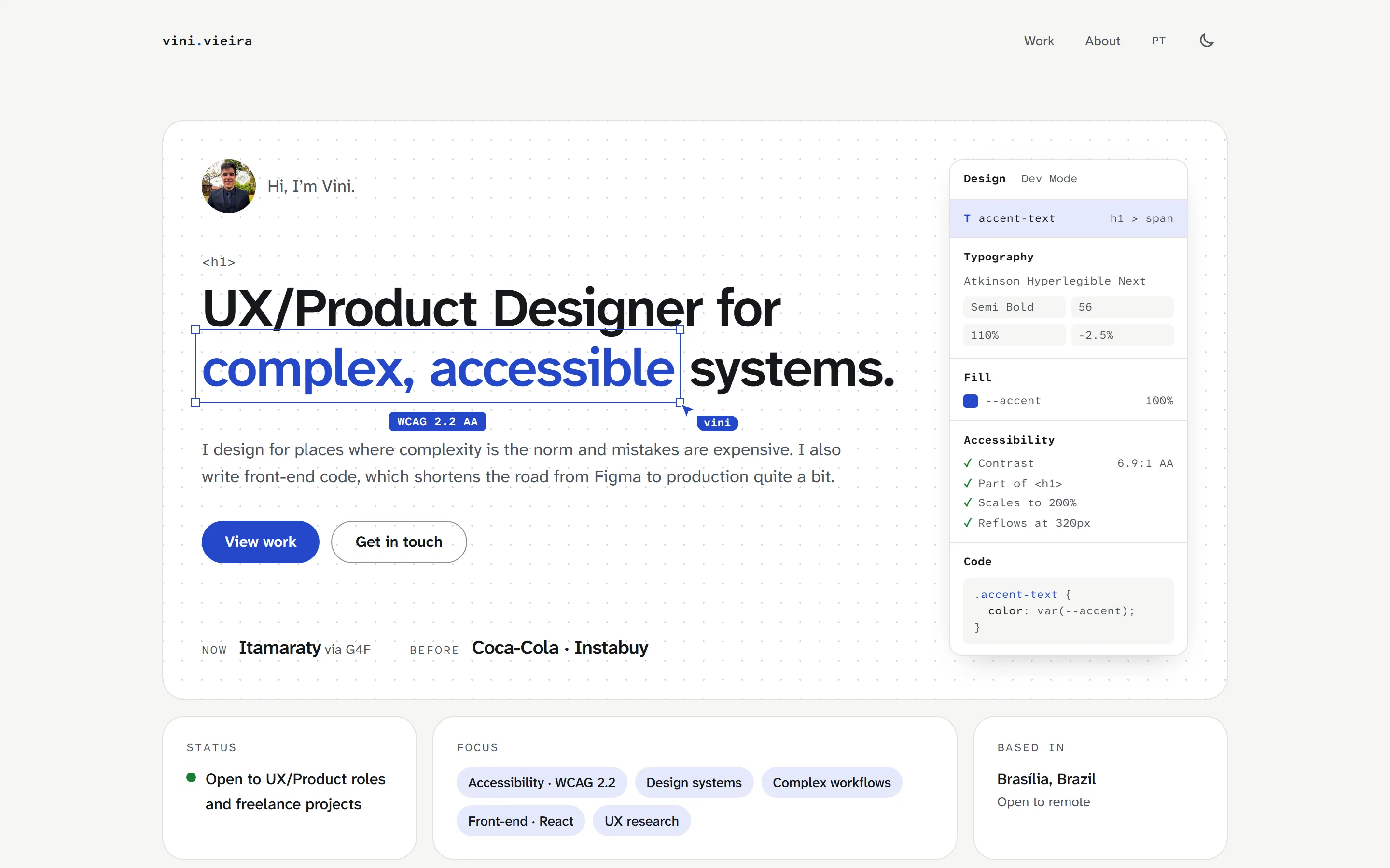
Before any pixel, I rewrote the positioning: UX/Product Designer for complex, accessible systems. I wrote a style guide for the whole site. Every project starts with the problem, then what I did and what changed. No number goes in without a source, and the copy avoids the patterns that make writing look machine-made these days.
A typeface chosen for legibility
I considered Rawline, the typeface of Brazil’s gov.br, because of my government work. I dropped it because it would make the portfolio look like an official service. I went with Atkinson Hyperlegible Next, designed by the Braille Institute for people with low vision, with similar letters made clearly different from each other.
Show “between design and code” instead of saying it
The first idea was a toggle that switched a form field between its design spec and its code. In the first review it was clear nobody would get what it was for, so it went. In its place came something you read at a glance: part of the headline selected as in Figma, with a cursor, a WCAG badge and a properties panel showing the real values for type, color and contrast.
Tell through process what an NDA hides
My most recent work can’t be shown. Instead of leaving a gap, the design system case study explains how I led and how the team works, with diagrams and a component recreated from scratch for the portfolio.
Light by default
The site is static, built with Astro, with almost no JavaScript, and it works even with JavaScript turned off. A content security policy blocks any outside script, and the server sends security headers on every page.
Accessibility
The site targets WCAG 2.2 level AA. It has a skip link, visible focus, 44px touch targets, contrast checked in light and dark themes, support for the system’s reduced motion and increased contrast settings, and for Windows high contrast mode.
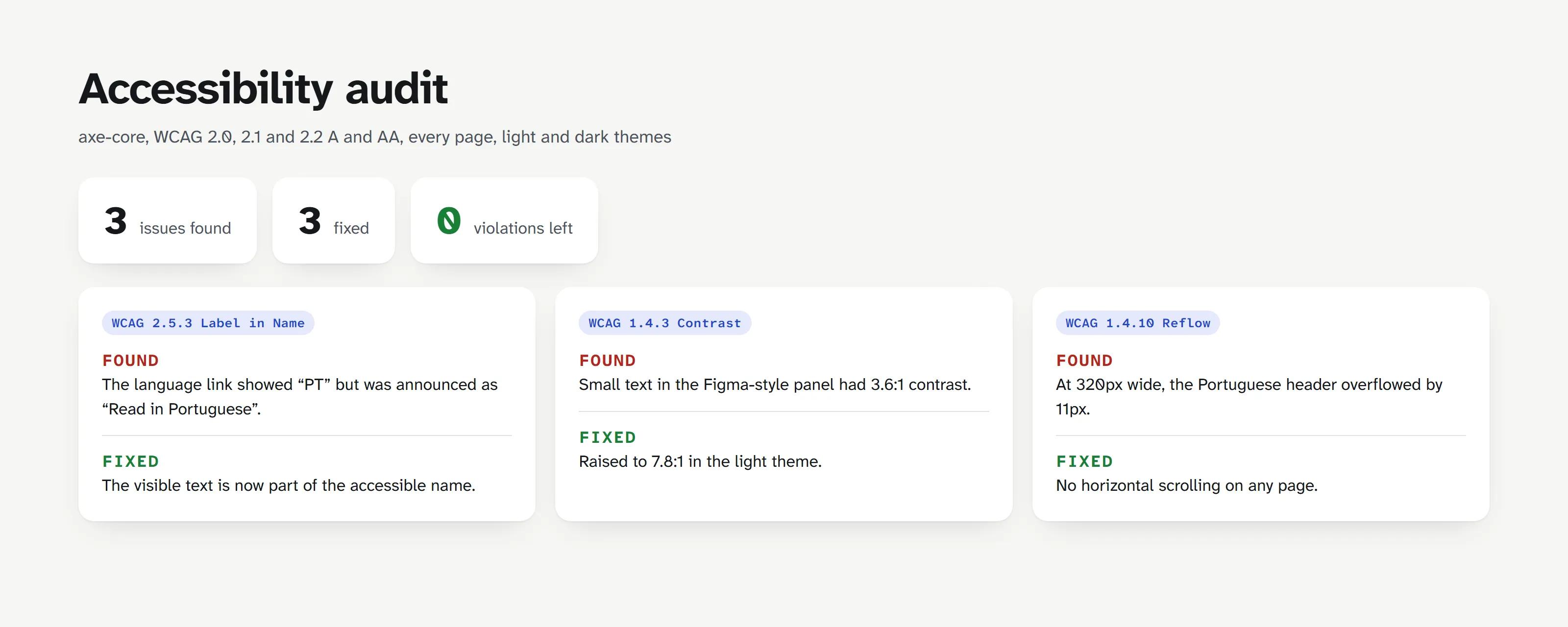
I ran axe on every page, in both themes. It found three real issues, and one of them is a good lesson: the language link showed a short label but was announced with different text, because its accessible name had been overwritten. That’s exactly what happens when you follow the common advice to “add aria-label to every link”.
Results
Zero axe violations on every page, in light and dark themes. The site is in English and Portuguese, with the same structure in both. Hosting is now free: from R$ 250 to R$ 280 a month down to zero, and the domain is the only thing I pay for. Publishing a change takes one push: in under a minute it’s live.
What I’d do differently
I’d test with a screen reader earlier. Automated audits catch a lot, but not everything, and a full NVDA pass is next on my list.