Instabuy · 2022
Instabuy website
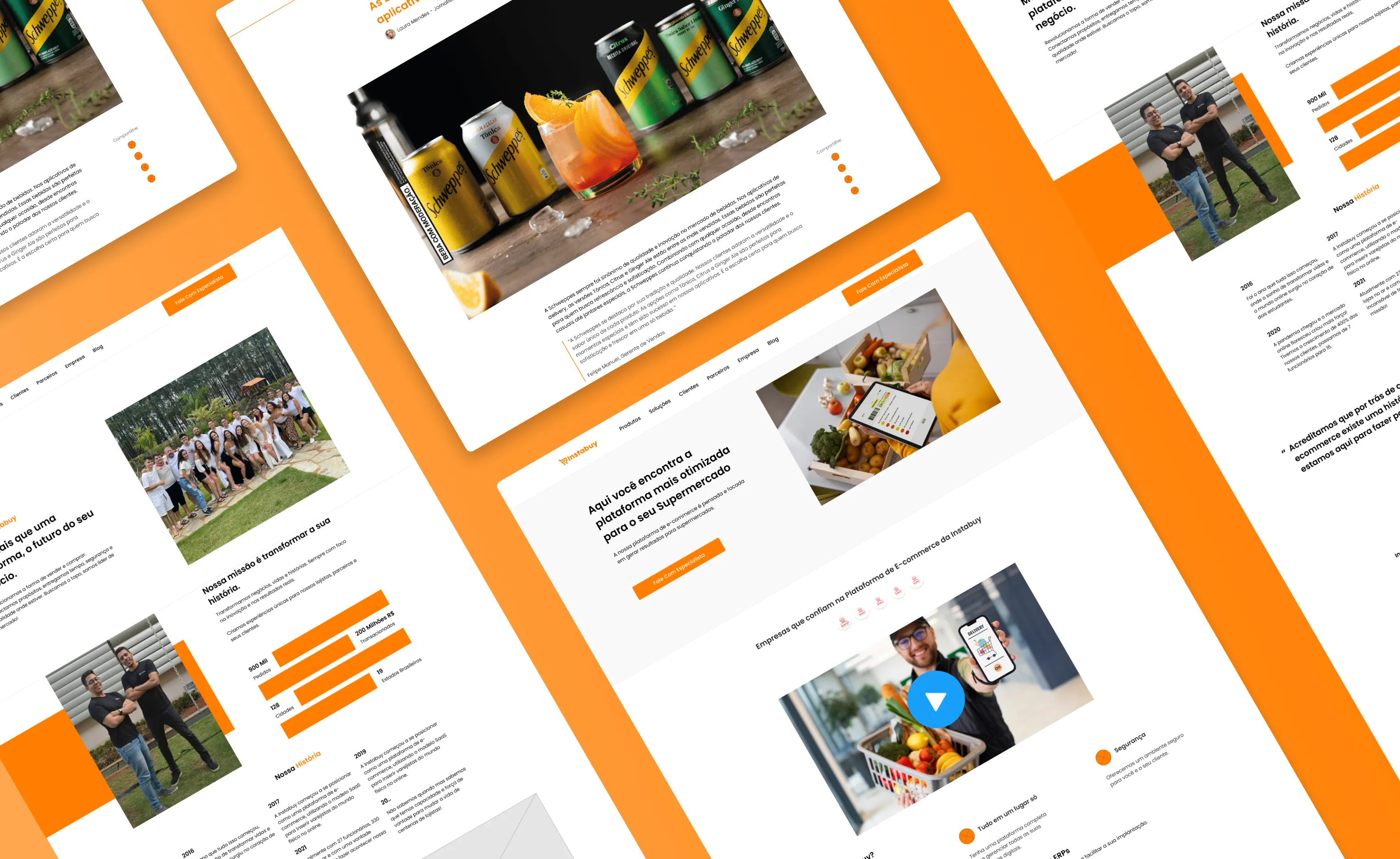
A supermarket SaaS website that had grown without a plan. I reorganized the content mobile-first and cut the path to vendor sign-up.
- Role
- UX/UI Designer, led the redesign
- Team
- Instabuy's marketing and development teams
- Platform
- Website, mobile first
- Year
- 2022
In short
- Problem
- Instabuy's website had grown without a plan. It was slow on phones, hard to navigate, and supermarkets gave up halfway through signing up.
- What I did
- I led a mobile-first redesign, reorganized the content around its two audiences and rebuilt the sign-up and contact forms.
- Outcome
- A clearer, faster site that finally matched the company's new positioning, with positive feedback from the client and early usability tests.
Context
Instabuy is a SaaS platform that puts supermarkets online: catalog, orders, delivery and tracking. Its website gets two very different visitors. Supermarket owners come to understand the product and sign up. Shoppers come looking for the store down the street.
The company was repositioning itself as a scalable e-commerce solution for supermarkets. The website was still telling an older story.
The problem
Years of additions had left the site with disconnected sections, repeated information and flows that led nowhere in particular. Before touching anything, we listed what worked and what didn’t:
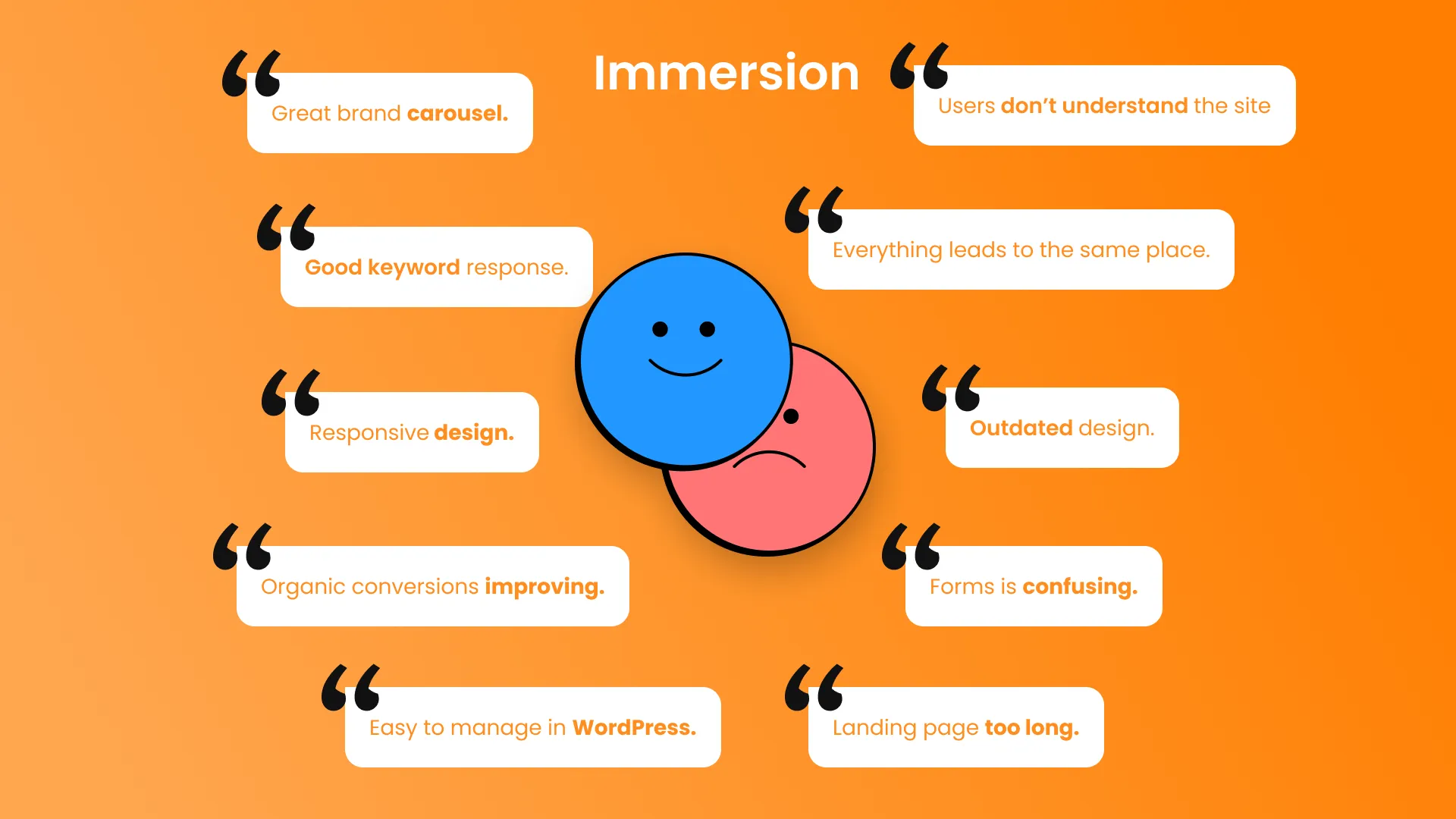
Some things were worth protecting, like strong search rankings and a CMS the marketing team knew by heart. The rest was the problem: visitors didn’t understand what the site offered, every path ended in the same place, the forms confused people and the design looked dated. Most visits came from phones, exactly where the site was slowest.
My role
I led the UX/UI redesign, working with Instabuy’s marketing team on content and with the developers on implementation and performance.
Key decisions
Mobile first, for real
Most visits came from phones, so every page was designed for the small screen first and only then expanded to desktop. That forced us to cut whatever didn’t earn its place.
Two audiences, two paths
“Everything leads to the same place” meant supermarket owners and shoppers were walking the same corridor. The new structure splits them early, and each visitor reaches what matters to them in fewer steps.
Shorter forms
Vendors were giving up during sign-up. The registration and contact forms now ask only for what sales needs at first contact, with clearer labels and fewer fields.
Keep what already worked
We kept the pages that ranked well and kept the site editable by marketing. A redesign that threw away years of SEO, or made every text change depend on a developer, would have created new problems while fixing old ones.
The solution
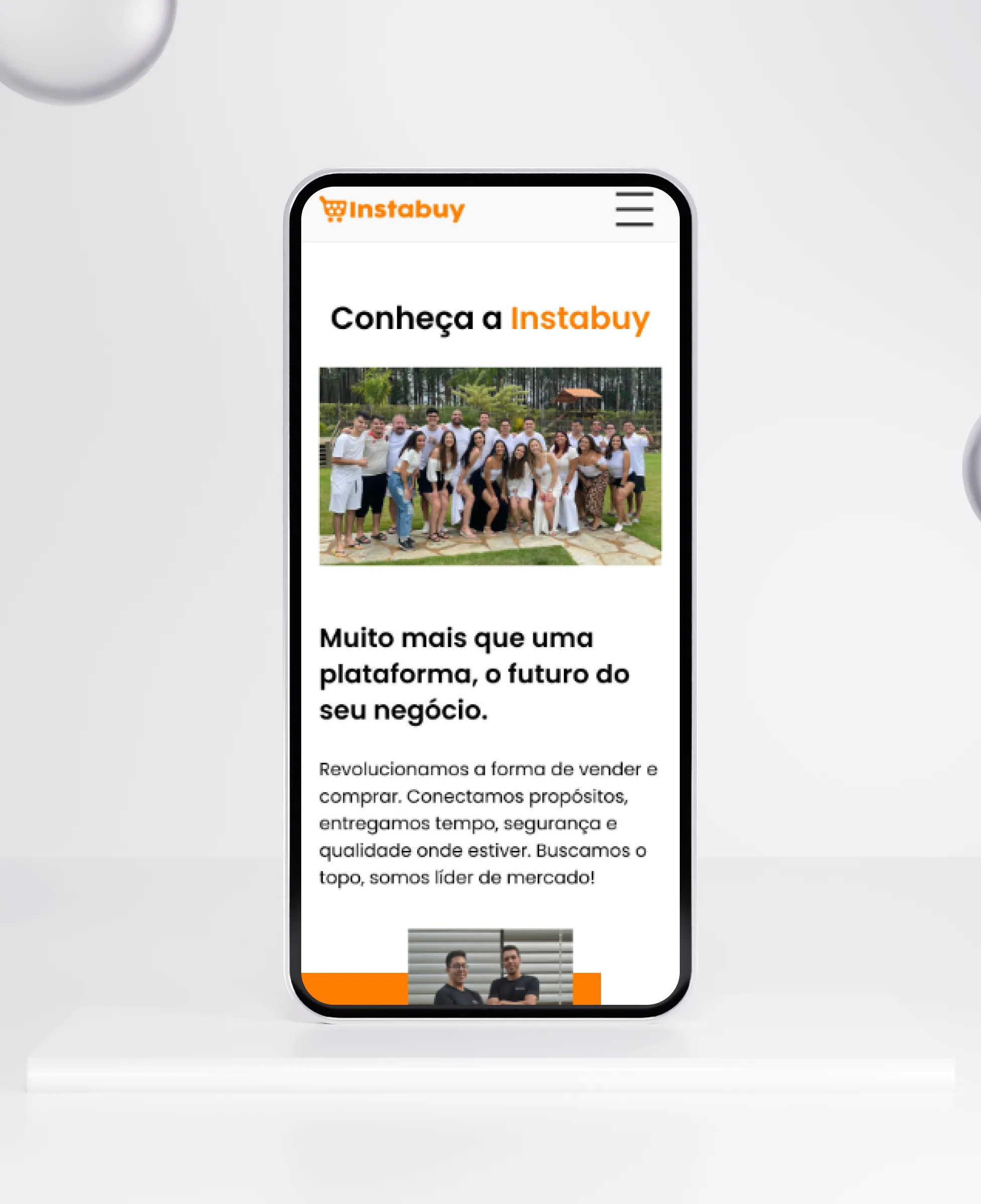
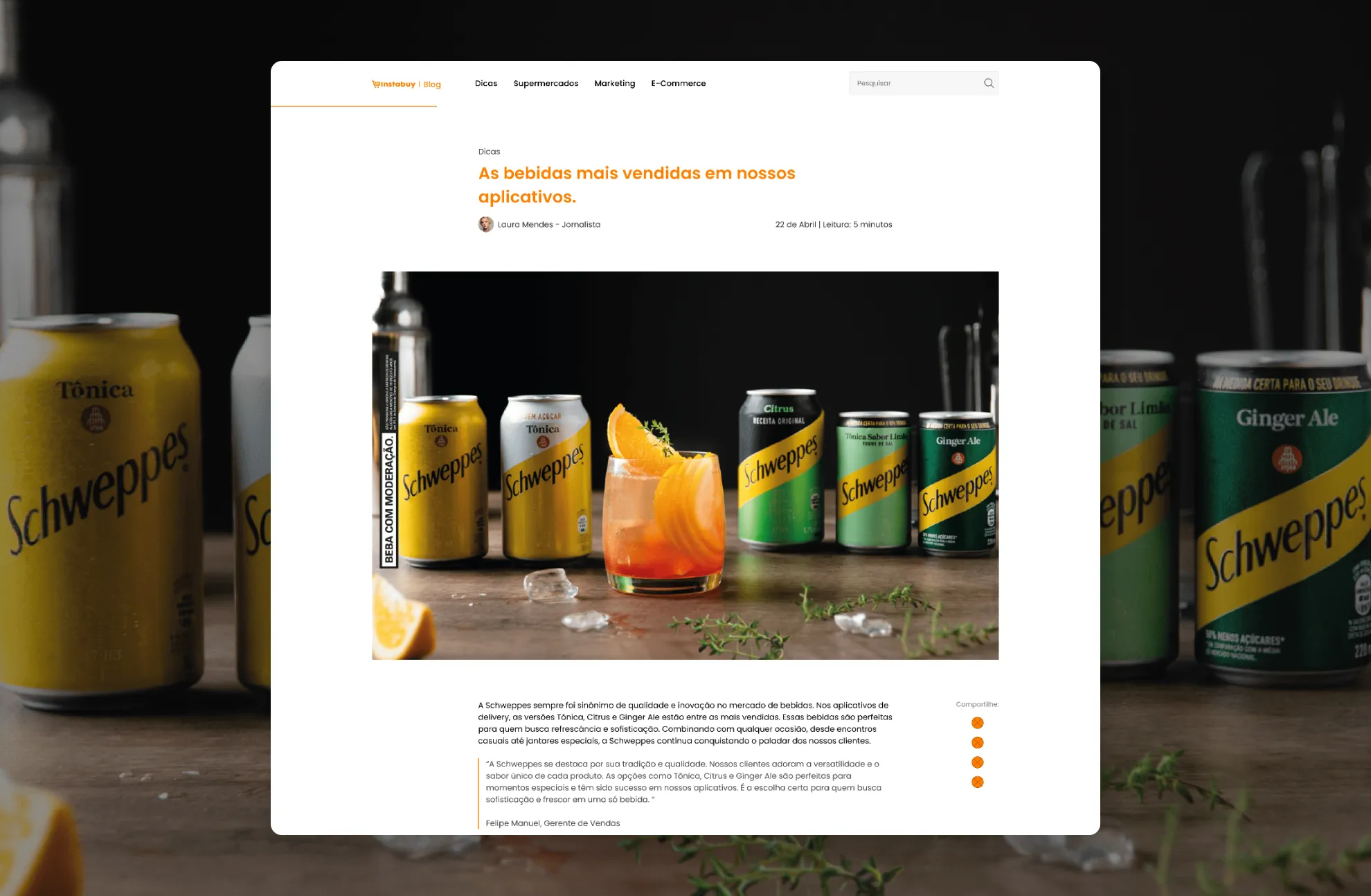
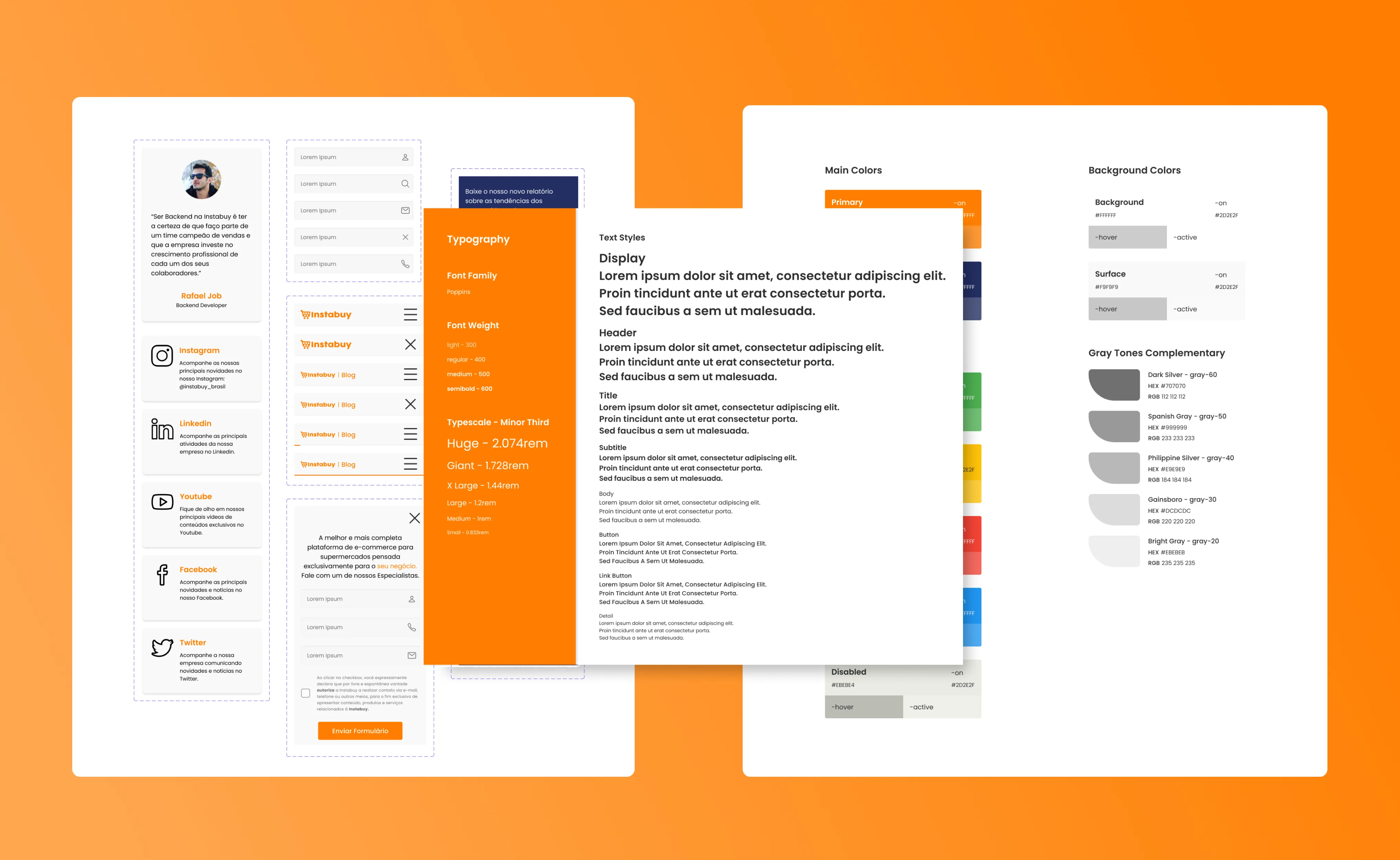
I also worked with the developers on how code and images were delivered, which helped the site load faster on phones.
Bonus: logistics landing page
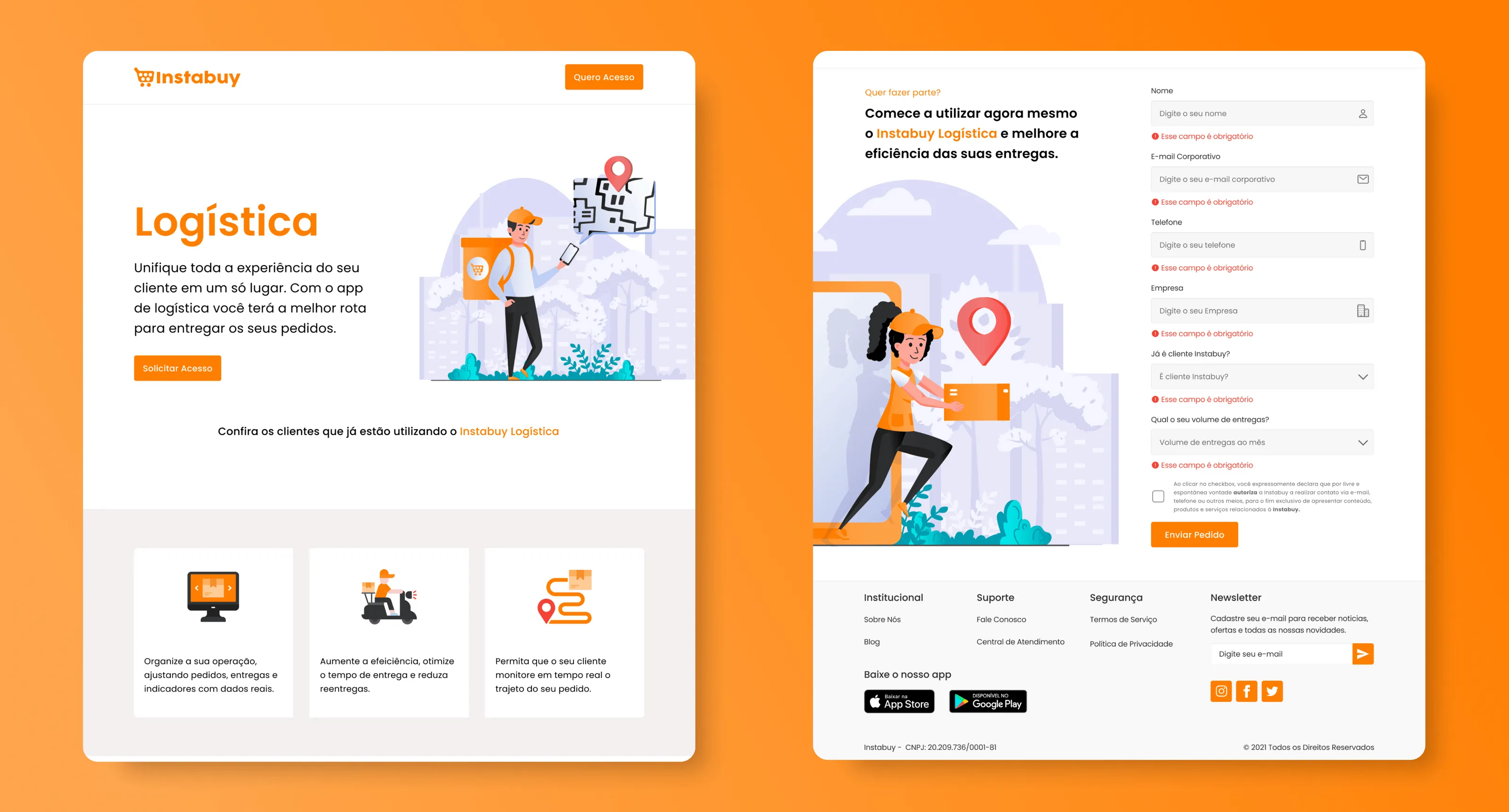
Instabuy was also launching a logistics service to help supermarkets manage deliveries. I designed its landing page, which presents route optimization and delivery tracking to supermarket owners. It reached the prototype stage and got positive feedback from early testers.
Results
We didn’t have full analytics after launch, but usability tests and early reports from the client pointed the same way: a clearer site, easier to navigate, faster on phones and, at last, telling the story Instabuy wanted to tell.
How I’d measure it today
I’d set up analytics before launch to compare mobile bounce rate, form completion and how long it takes a supermarket owner to reach sign-up. Without a baseline, even a good redesign is hard to prove.